I was asked to help re-create the corporate identity for Hotel Arena and their brand new café-restaurant Park.
Hotel Arena has 4 stars, 119 rooms and a monumental building dating from 1886. It has been thoroughly renovated and expanded recently.There is a whole new wing added with studios and a huge Patio. There is also an original, restored chapel, complete with stained glass windows. This dates from the time when Hotel Arena was a Catholic girls' orphanage. Later, the chapel became a music venue and the orphanage turned into a Sleep-in with bunk beds and full of young people. With the expansion of the hotel, the Oosterpark is now the natural entrance to Hotel Arena. The parking garage has gone underground, making the green area flows seamlessly into the park.
Hotel Arena has 4 stars, 119 rooms and a monumental building dating from 1886. It has been thoroughly renovated and expanded recently.There is a whole new wing added with studios and a huge Patio. There is also an original, restored chapel, complete with stained glass windows. This dates from the time when Hotel Arena was a Catholic girls' orphanage. Later, the chapel became a music venue and the orphanage turned into a Sleep-in with bunk beds and full of young people. With the expansion of the hotel, the Oosterpark is now the natural entrance to Hotel Arena. The parking garage has gone underground, making the green area flows seamlessly into the park.
3D rendering by Team V
Below the research and various proposals for the typography and icons my partner Christiaan Dros and me did,
before the final logos and icons were chosen.
before the final logos and icons were chosen.
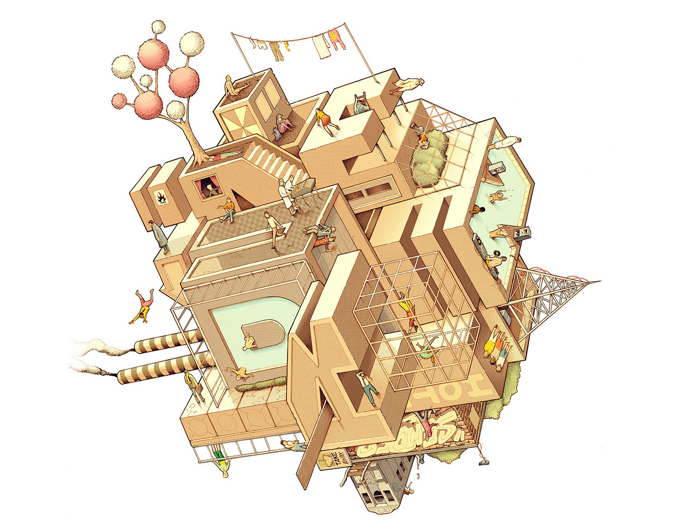
We tried to put many elements of the classic building and it's ground plan into the designs of the icons.
Below the final logo and icon that was chosen, after that I designed two matching logos for their restaurant and chapel.
Logo on top of the chapel, made of weathering steel (corten steel) with backlight.
For the corporate identity I developed many items such as room directories, vouchers, templates for their newsletter and powerpoints, stamps, keycards, all the stationary and in room menus. Together with digital agency Pangaea I helped developing the new websites for Hotel Arena & Café-restaurant Park.
Besides all the printed material, my team from the Amsterdam sign painters and me painted all the routing and wallpaintings for the hotel and restaurant by hand. All the carpentry of the signage was done by Roebuust.
Photo credits: GDandP
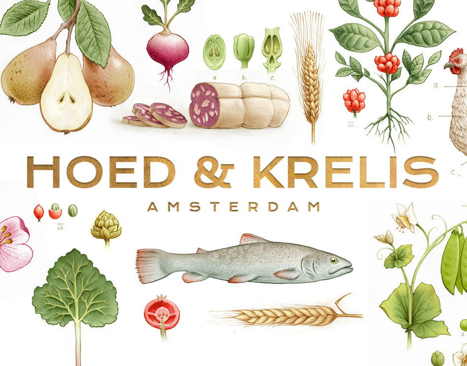
To finish of this project I created various designs for the hotel it's café-restaurant Park. The designs had to be in line with the concept of the hotel but it needed it's own separate identity as well. We chose to keep everything white and replace the 19th century paintings style by antique engravings to make everything look clean and fresh.
Hand painted reverse gold gilded signs on the windows.

