A new hotspot for coffee and lunch just opened it's doors: Mortimer Amsterdam.
This place has some seriously delicious sandwiches and good music!
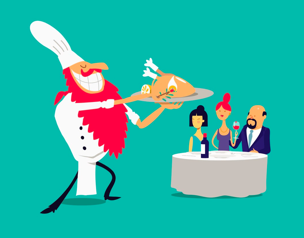
For the design, we looked at something stylish because the dishes are top notch quality,
For the design, we looked at something stylish because the dishes are top notch quality,
served by my friend Robbert, who is the owner and cook of this charming place.
Below you can see the various proposals plus the final designs.
We could not find the right font for the logo, so we created this one from scratch.
After we decided the direction of the typography, we created some kitchenware Icons to accompany the logo.

