DE HOORNEBOEG
A while back I was asked to create the corporate identity of a cultural estate called De Hoorneboeg. The beautifully located Hoorneboeg lies in the middle of 13 hectares of forest around an old hill, just south of Hilversum.
The Hoorneboeg is a collaboration project of five initiatives with an emphasis on contemplation, nature and health. There is a restaurant called 'Bij de Tuinman' that cooks from its garden, a distillery called De Elegast where they make home-brewed cider. Aan de Hei which is a training centre, a sauna and where anything from massages till yoga courses can be taken. In de Villa is a cultural space where social development is the main focus. In the Luwte is a location for training, workshops and individual guidance. See the website here.
The complexity of this job was to get all companies happy with the design, so for that matter, I designed various examples of type, icons and mood boards until they were all satisfied.
Aan de Hei has 19 bedrooms, in total 26 participants can stay overnight. You will also find a large training room, room for group sessions, a living room, a large kitchen, a spa with sauna and a treatment room.
Some rejected proposals:
Finally, after various revisions we set upon a typeface and Icon that we all liked:
clean and easy to read plus an icon with De Hoorneboeg symbolised by a small house surrounded by nature.
clean and easy to read plus an icon with De Hoorneboeg symbolised by a small house surrounded by nature.
Below the final approved logo plus a few customised versions for the other initiatives:
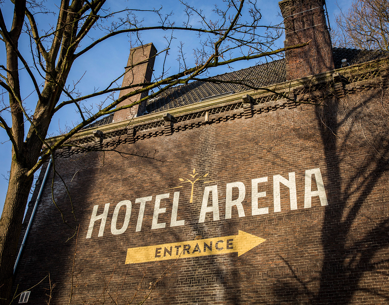
In de Villa can be seen on the picture above, the building dates back from 1882
When all the logos and icons were approved we finally designed the website. Eenvoud did the coding and programming.
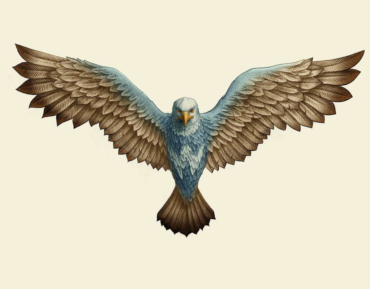
For the vegan restaurant Bij de Tuinman located in the farmhouses above, we created a logo that was related to The Hoorneboeg logo but could also stand alone. The reason for this being the fact that they also want to attract customers that have no particular interest in the other activities present at De Hoorneboeg.
After a short study, we ended upon a classic engraving style that they liked best.
